logius-kennisbank
Logius Kennisbank
User testing
Product design
WCAG / Accessibility audit

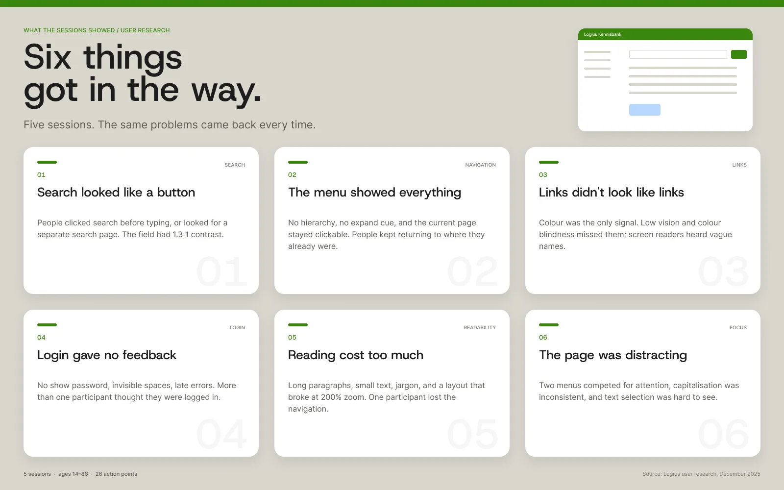
Logius' knowledge bank is where the customer contact centre looks up the answer to almost every DigiD question. It started as a 500-page Word document, became a website in 2020 under time pressure, and has been extended ever since. Now Logius wants to open it up to external aid organisations. Their volunteers did not grow up with the interface. Some are younger, some older, some are living with a disability. The question was simple: can they find what they need? I led the redesign and worked across the research. I audited the shared header and two article templates, ran user sessions, interviewed people across Logius, and turned the findings into the new search, navigation and article screens. The team split the audit and the sessions. I brought the findings together.
How I worked
I started with a desk review of the knowledge bank, Logius' accessibility policy and WCAG 2.1. Then I worked through four stages. 1. WCAG audit. The team audited twelve pages: home, login, news, FAQ and article templates. I took the shared header and two article templates, then compared findings with the rest of the team. Each page was tested with a keyboard, a screen reader and 200% zoom, plus contrast checks and a code review. Fourteen WCAG 2.1 A/AA criteria failed. 2. User research. Five 90-minute sessions at Stichting Accessibility in Utrecht, in December. Participants were 14 to 86. One was a teenager, one had ADHD, one was 86, one had low vision, one was neurodivergent. Everyone did the same three tasks: find a news item, find how to log in with a driving licence, and save an article. I ran sessions and coded the notes into themes. 3. Organisational analysis. The analysis included five interviews across Logius: the knowledge manager, a senior contact centre colleague, the product owner, the functional manager and a contact centre colleague who writes FAQs. I ran several of them and coded the rest. I asked who owns accessibility, how it is tested, and what happens to the findings. 4. Synthesis and redesign. I compared the audit with the session notes, grouped the problems that appeared in both, and turned them into a set of before/after screens. Then I wrote a three-step plan for Logius.
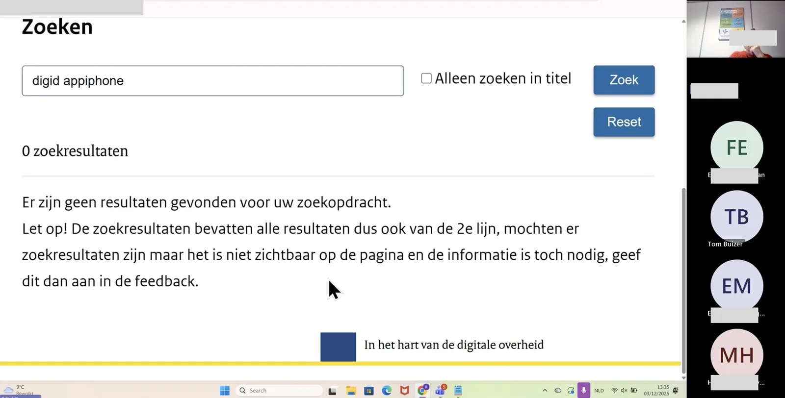
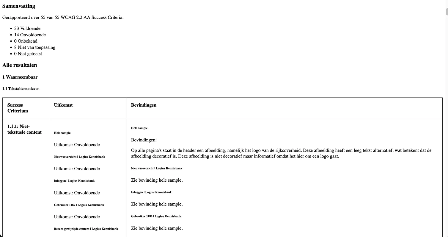
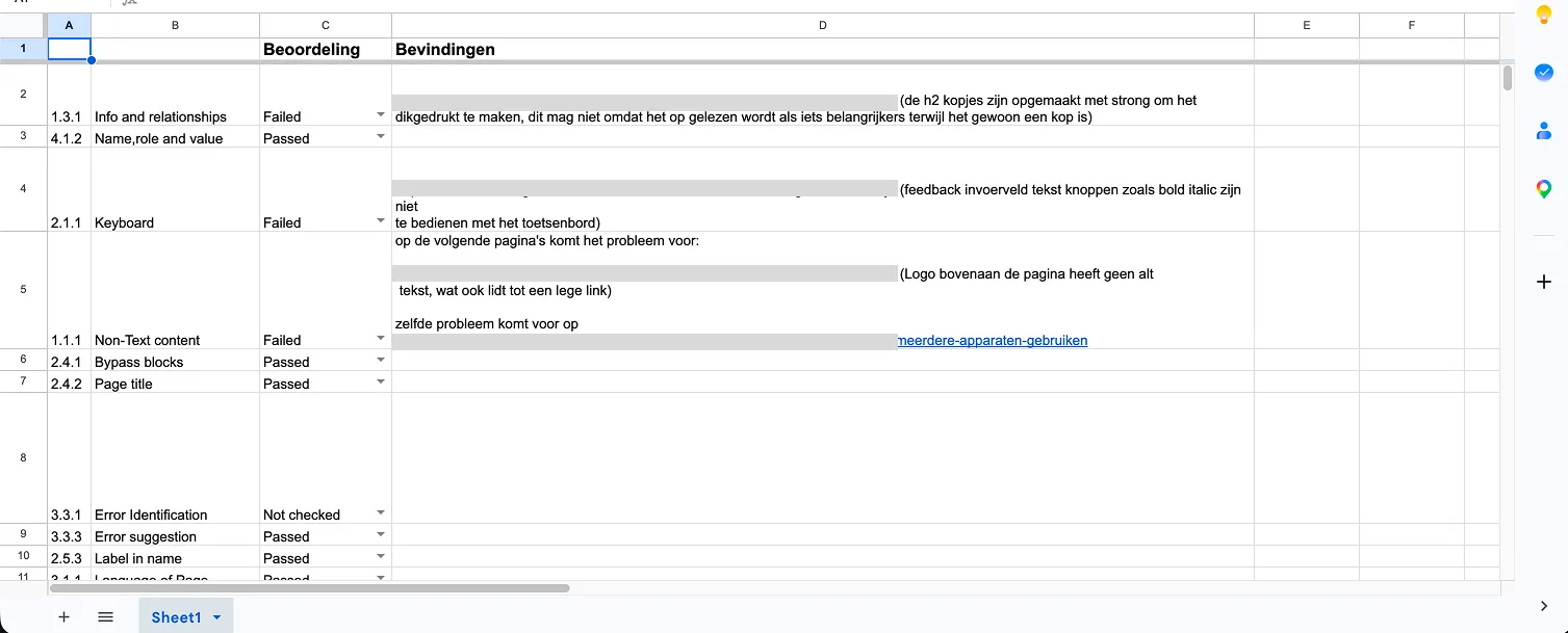
The audit was not a list of small mistakes. The same problems came back across templates. The search field had 1.3:1 contrast against the yellow header. WCAG asks for 3:1 for interface components. Links were distinguished by colour alone. People who are colour blind could not tell them apart from body text. The grey metadata under articles had 2.1:1 contrast. It needs 4.5:1. Form borders had 1.6:1 contrast. Error text sat at 3.9:1 on a light red background. Status messages were not announced by screen readers, and the icons in the feedback field could not be reached with a keyboard. Headings were styled to look like headings but coded as strong. The page structure disappeared for screen reader users. At 200% zoom, video controls, an email address and the admin toolbar fell out of view. The Rijksoverheid logo had an empty alt text, the video had no name, and the driving licence image missed the arrow and the ID detail in its description. The full audit report lists all fourteen failed criteria and the pages where they appear.